10 Anime Character Design Tropes That Went Out Of Style (& Shouldn't Come Back)
Descriptions

Like all tropes in anime, character designs constantly shift and change, bound to morph according to most novel trends. While most see the look of anime as consistent and relatively uniform, the differences between characters created today and even just a decade ago are jarring, not to mention the contrasting designs of anime heroes from the medium's early days.
Captivating character design, regardless of which tropes it embodies, is the key to creating recognizable, memorable heroes whose personality shines through the elements of their visual aesthetic. Unfortunately, some past trends in anime character design hindered the medium's expressiveness instead of aiding it. These outdated character design tropes might've been the staple of anime visuals in the past, but fans are glad they went out of style.
RELATED: 15 Harsh Realities Of Watching Classic Anime Series
10 Disproportionally Giant Eyes
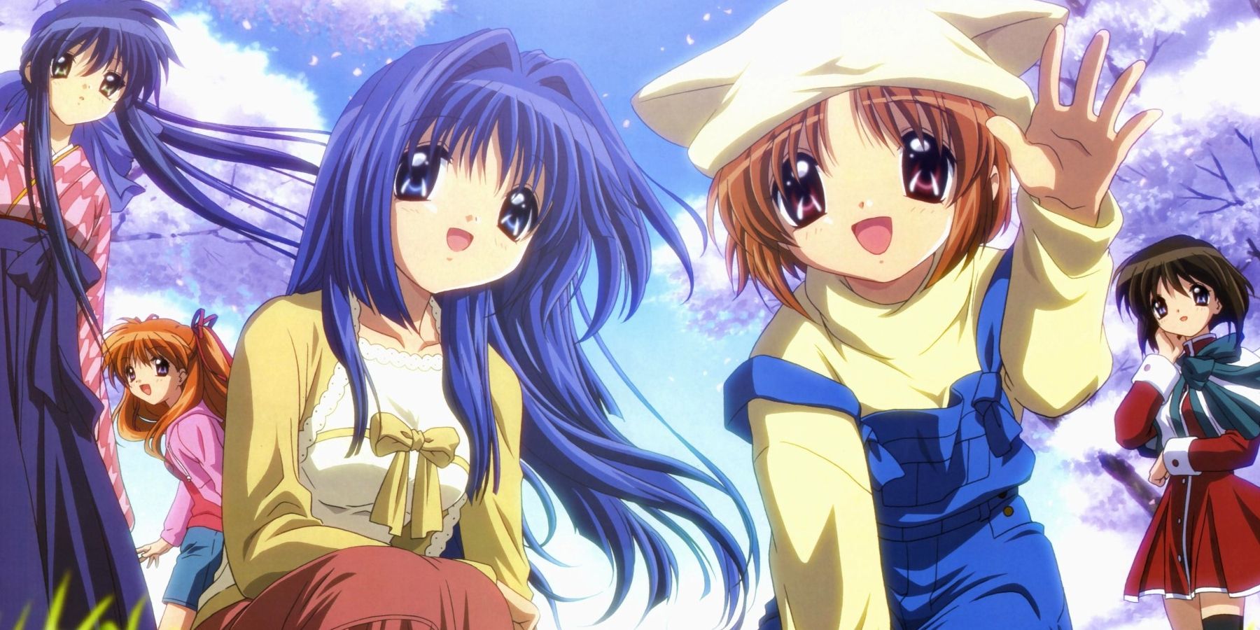
Large eyes that emphasize the cuteness of an anime character have always been a staple of the anime art style. However, this trope used to be taken to its absurd maximum in many early-2000s moe shows. The oversized eyes of Clannad, Kanon, and Ijime: Ikenie no Kyoushitsu have been relentlessly ridiculed for their exaggerated appearance.
The eyes of some characters used to cross the line from cuteness to outright hideousness. Thankfully, even moe shows today try to give their characters somewhat realistic proportions. While characters like Spy x Family's Anya and K-ON!'s Yui might have big eyes, their features remain human-like and appealing.
9 Hairstyles Tied To Personality Tropes
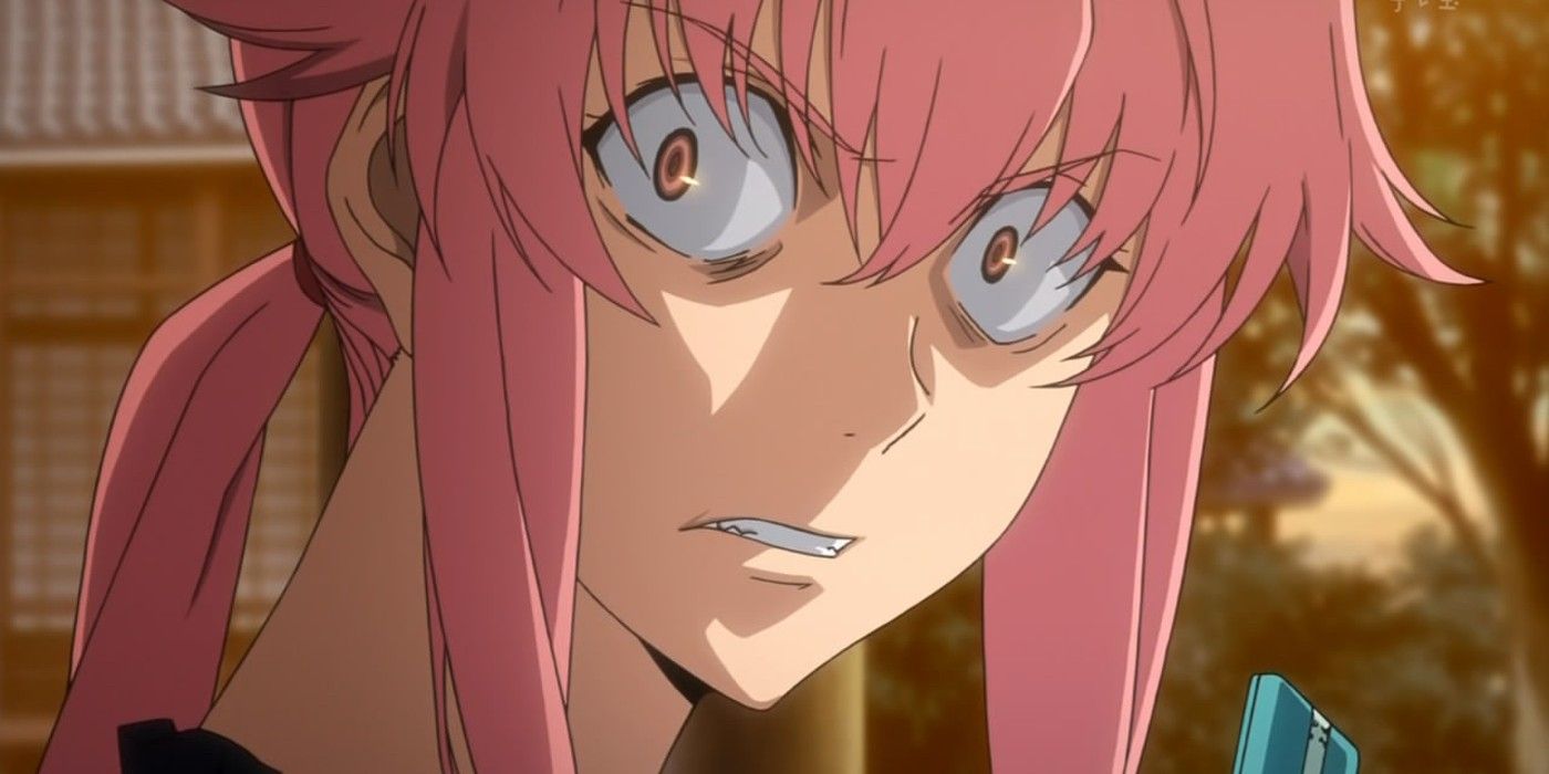
Be it a pink-haired yandere, a tsundere with twin pigtails, or a silent type with a short blue haircut, anime archetypes are tied to looks way too often. One look at Yuno Gasai from Mirai Nikki or Ayanami Rei from Neon Genesis Evangelion gives viewers an immediate impression of these heroines' personalities. While it's good to have recognizable designs that incorporate the character's attitude in visual elements, many classic clichés tied to depicting a certain archetype have long since become redundant.
Thankfully, anime has been improving the uniqueness of its designs as of late. A character like My Hero Academia's Himiko Toga might be a yandere. Yet, nothing in her looks suggests her love-obsessed personality at first glance, making her design much more compelling and nuanced.
8 Same Face Syndrome
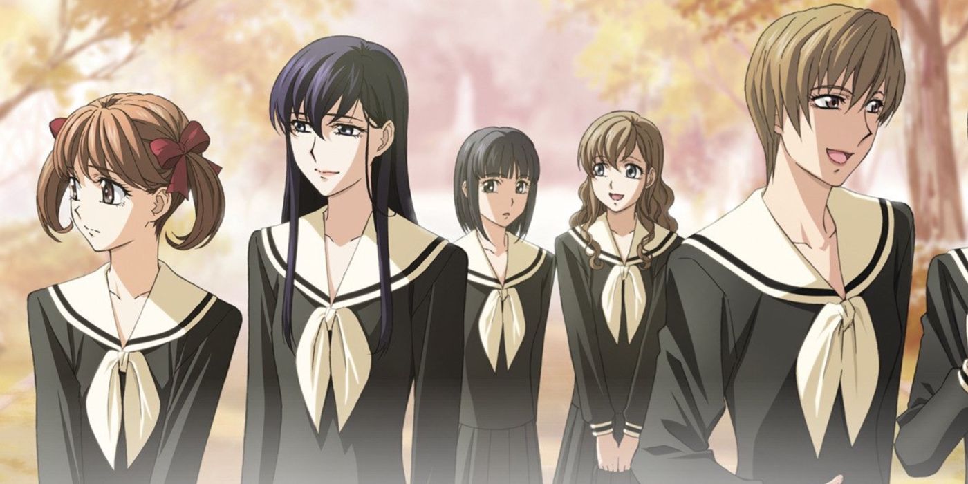
Many consider that modern anime has it bad with the same face syndrome, a phenomenon when all characters share the same face shape and features distinguished only by details like hairstyle or accessories. However, this issue was even more prominent back in the day, as the same face syndrome wasn't exclusive to works by a single artist but spread throughout the medium.
It's natural to have character design tropes adopted throughout an entire anime era. Yet, today's anime is much less reliant on keeping its character designs uniform. While one can easily confuse a character from Maria Watches Over Us for someone from Blue Drop, it's much less likely they'll accuse Toilet-Bound Hanako-kun and Demon Slayer of having same face syndrome.
7 Bishonen & Bishojo Designs
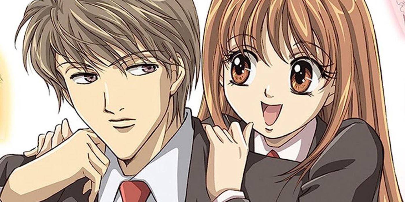
Popular in shojo manga of the '80s and '90s, bishonen and bishojo character designs refer to a specific style of depicting particularly dreamy characters that emphasizes their attractiveness to an absurd degree. Classic bishonen boys used to have feminine yet sharp facial features, lean, unnaturally tall frames, and a glowing aura, often visualized by sparkles surrounding them.
Bishojo girls, while a bit more down-to-earth, were also comically idealized, with giant galaxy eyes and fragile, miniature frames. Nowadays, the character designs of Niji no Densetsu and ItaKiss look dated due to their overabundance of stereotypes and melodramatic depiction of emotions.
RELATED: 10 Cutest Anime Guys Who Also Pack A Punch
6 Unrealistically Lanky Body Proportions

In the '90s and early '00s, it was common to see anime characters whose bodies resemble stick figures more than realistic human forms. Older shojo series, like Sailor Moon, as well as almost every show by the artist group CLAMP, feature characters with disproportionately long legs and oddly thin limbs, which makes ordinary people look oddly tall and unstable.
Some examples of this trope were rather tame, while others, like xxxHolic's horrifyingly inconsistent character models, are remembered to this day as the worst character designs in anime. Thankfully, even commonly thin shojo heroines of today look relatively proportional.
5 Gravity-Defying Hair
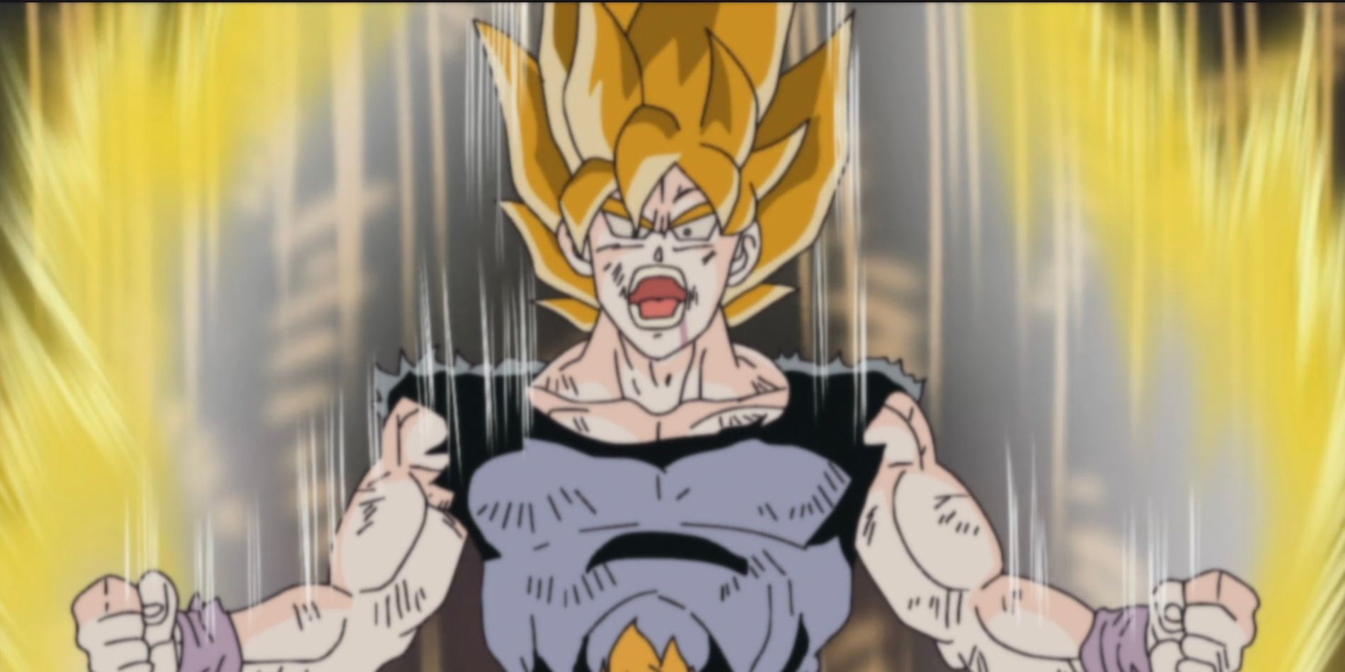
From the unicorn horn on top of Grevil Blois' head in Gosick to Goku's iconic spiky hairdo, anime characters are famous for their gravity-defying hairstyles. Shonen protagonists from older shows commonly have absurd hairdos that stick out in all directions, even when they clearly do nothing to style it.
Gravity-defying hair still pops up in modern anime from time to time. One example is Senku's wild green spikes in Dr. Stone, but most series today opt for a much more down-to-earth look, adding uniqueness to the characters' hair through accessories and distinctive cuts.
4 Absurd Hyper Masculinity
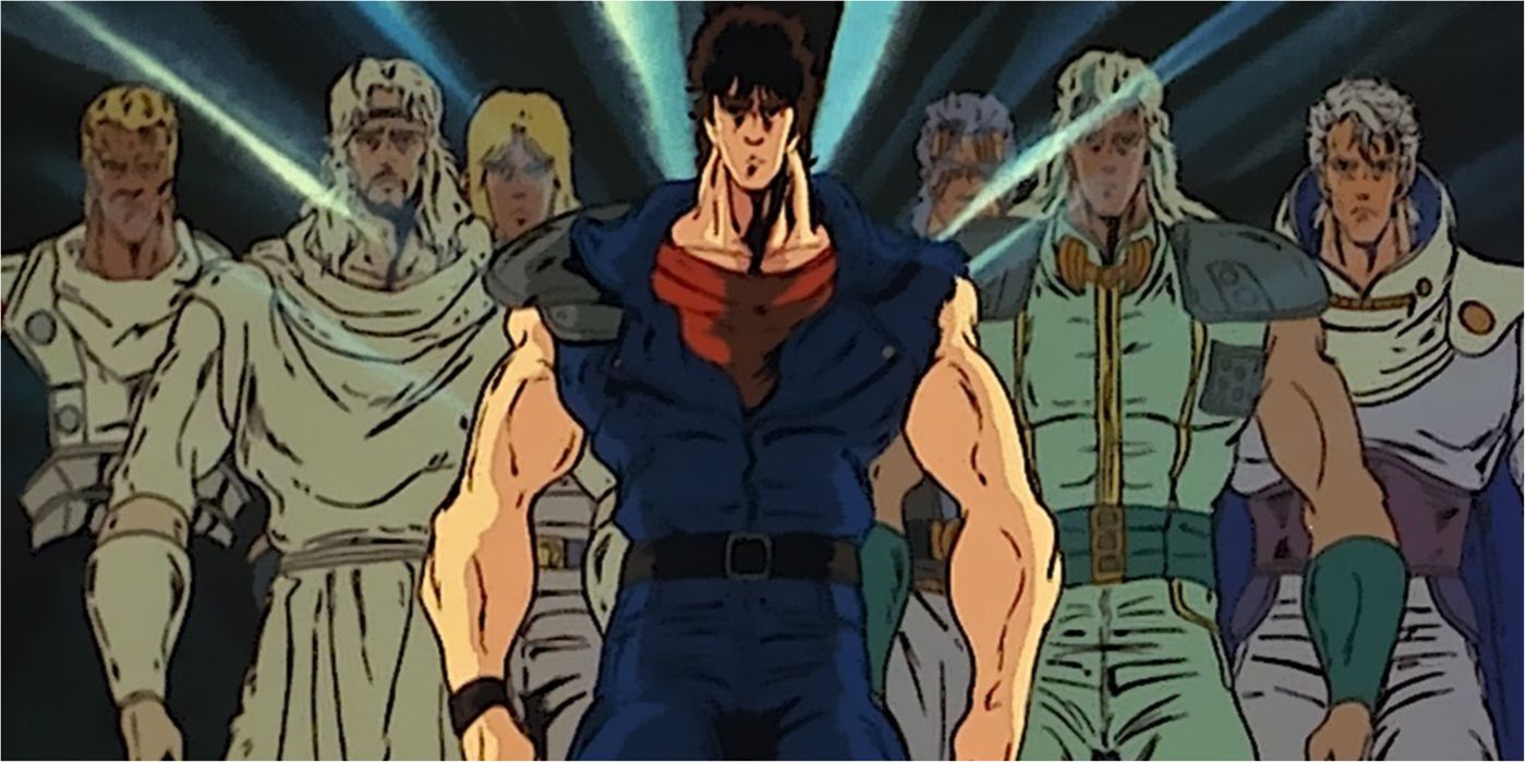
All fans of '80s shonen classics like Fist of the North Star and Charge!! Men's Private School remember their absurdly buff, intimidating, hyper-masculine character designs. A standard action hero used to tower over his opponents like a human brick wall, muscles bulged out of their clothes, and expression always contorted in a formidable scowl.
At the time, these exaggerated designs were the most straightforward way to convey the hero's strength. However, modern shonen protagonists are considerably slimmer and more realistic, which makes them look relatable rather than comically over-trained. The best example of this trend's slow death is the transformation of Jojo's Bizarre Adventure's character designs from the '80s powerhouses of Phantom Blood to the pretty boys of Golden Wind and Steel Ball Run.
RELATED: 15 Most Muscular Anime Characters, Ranked By Muscle Mass
3 Angular Character Designs
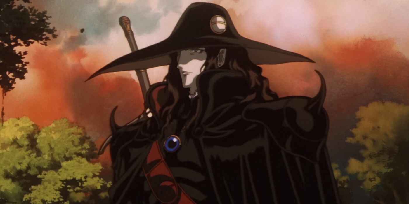
Today's anime fans are used to most characters having soft, round features, be it a heroine of a moe flick or an expressive action hero. Yet, this charming, easy-on-the-eye aesthetic wasn't always popular in character design. During the '90s, sharp features and angular, mature-looking character designs were all the rage.
Such characters often looked more realistic, which made them popular in grounded, adult-oriented series like Neon Genesis Evangelion and Vampire Hunter D. However, when taken to the extreme, characters with overly sharp features look needlessly intimidating and intense. As anime moved past its edgy phase, character designs softened, and even realistic anime today manages to make its heroes look down-to-earth without constructing them out of sharp corners and angles.
2 Needless Sexualization Of Female Characters
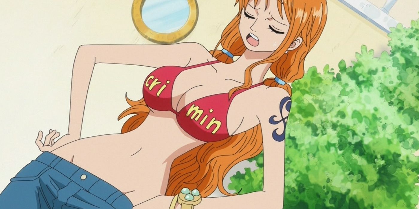
Hyper-sexualized heroines remain a common occurrence in anime today. Yet, the trend to put female characters in skimpy outfits without any purpose has, thankfully, died down over the years. In the past, relentless fanservice was the norm, even in the shows that had nothing to do with their heroines’ attractiveness. Infamously, popular series like One Piece and Gurren Lagann made their female characters engage in life-or-death battles wearing close to nothing.
Today’s anime has much more respect for its heroines, especially in the previously guilty shonen genre. Chainsaw Man, Jujutsu Kaisen, and Attack on Titan prove that well-written shonen heroines can be compelling without fan service.
1 Over-Designed Protagonists
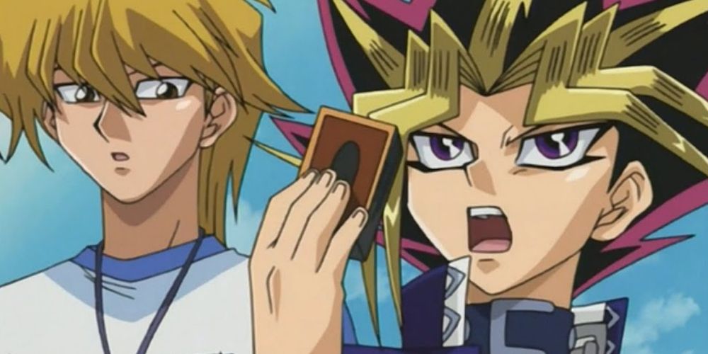
In older anime, spotting the protagonist in a crowd of people is almost comically easy considering how much they stand out from regular background characters. Spiky multicolored hair, intricately decorated clothing, and the overall prevalence of opulent detail compared to everyone else make the main characters easy to recognize at first glance. While the hero needs a recognizable, unique look, their design must fit in with the rest of the cast.
Looking at Yu-Gi-Oh!'s Yugi Muto surrounded by ordinary people is hilarious due to how much-unneeded effort was put into making his design stand out. Tamer and more realistic modern heroes like Mash Burnedead from Mashle and Itadori Yuji from Jujutsu Kaisen look interesting without seeming out of place in their worlds.
Add a review